Attended the "Chapter 13" AIGA NY event for the release of Design for People at Parson's The New School. Discussion included the editors, designers, researchers, assistants and Scott Stowell himself.
Read MoreDesign for People →

Attended the "Chapter 13" AIGA NY event for the release of Design for People at Parson's The New School. Discussion included the editors, designers, researchers, assistants and Scott Stowell himself.
Read MoreOn set with Jeff Bucari shooting for an upcoming campaign!
Read More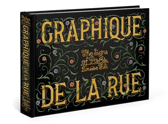
Looking forward to attending the lovely Louise Fili's event for her new book, Graphique de la Rue: The Signs of Paris, and to catch up with everyone from our class who will be attending!
Read MoreDay 1 — Pantheon
I’ve just arrived in the ancient city of Rome!
Our hotel is a stone’s throw from the Pantheon. The Pantheon!—one of the world's most well-preserved ancient Roman structures that’s managed to survive almost 2,000 years of barbaric raids whilst the majority of Roman monuments crumbled to the ground.
Not only has it remained physically intact, it’s adapted to the transitional religious and political landscapes throughout history—all the while continuing to amaze and inspire artists, architects and designers alike with it’s magnificent and mystifying form and function.
Probably the most impressive of it’s features is the architecture—specifically, the giant unsupported concrete dome. From the outside, the structure is quite striking; thick brick walls, large marble columns—it has an immediate impression on it’s visitors. Although either of the five vias leading to the piazza della Rotonda would provide an excellent exterior vantage point, it’s impossible to get the full effect of the Pantheon’s true phenomena until you’re inside. A generous beam of light protrudes from the oculus, illuminating the geometric concaves and convexes of the cylindrical interior walls. As Michelangelo once said, it looks more like the work of angels than of humans. I’m getting ahead of myself.
I've always been awed by the “believe it or not” phenomena. Strange talents, bizarre habits, deformations, exotic cultural customs—fascinating oddities that both amaze and appall. When I heard that the Yale School of Art was launching their 2015 season with an exhibit devoted to the American sideshow, I must admit, I was intrigued.
The exhibition "Sideshow" presents more than 50 works, ranging from the mid-18th century to present, including banners, props, photographs, posters, historical ephemera, and works of art inspired by circus and carnival culture. The show focused on the abnormal and bizarre and those marginalized by society because of a physical disability, a deformity or an unusual gift. It investigates the intersection of fine art and the now popular entertainment world of the carnival sideshow.
I attended the opening night of the exhibition, which commenced with a lecture given by historian, magician and collector, Ricky Jay. The lecture was followed by an opening reception under a large enclosed tent, featuring cotton candy machines and other carnival-inspired confections—reminiscent of the traditional big-top experience.
I was able to sneak into the gallery before the reception to capture a few shots of the exhibition, ahead of the crowd. The show unquestionably inspires curiosity, provokes questions and encourages dialogue around the history and progress of social behavior. At the very least, the show certainly entertains.
The exhibit is on view from January 13–March 20, 2015, at the 32 Edgewood Avenue Gallery.
I believe in fiction—and non fiction too. I believe literature has value. As the most developed and lasting form of story telling, literature is a way to explore the human experience. Language is one of the first things we learn and train everyday. Language, and its role in communication, has the power to change our lives, to offer meaning and purpose.
Living in a high-tech age, it’s easy to forget that ‘technology’ didn’t always mean the latest gadget. It began with taking natural resources and converting them into simple tools. Technology is essentially the usage and knowledge of tools, techniques, systems or methods of organization.
If we think of language and letterforms as a technology then one might say that typography is a result of an evolution in technology. Acknowledging that a society interacts with and even shapes the technologies that it uses, it's also true that the uses made of technology are largely determined by the design of the technology itself. Function follows form. As a technology is developed, its design tends to influence a user’s behaviors. It’s hard to make the distinction whether a society determines a technology or vice versa but it’s clear that the two are equally interconnected and they both rely on each other for change.
The technology of typography has certainly evolved over the years. I wonder what communication processes in the past demanded the need for change and what types of technological advancements in typography enabled them to take place. The movable printing press was a great revolution in renaissance information technology. It arguably provides the closest parallel to the development of the Internet. I think its important to look at history as a means to understand the present and shape the future. If we are going to prepare to participate as active designers shaping the world of tomorrow, we must study the technology of communication at it’s most basic letterform and follow that process of it's evolution.
We must understand that the history of communication and the technologies that shaped typography didn’t just happen, they were created. And we have a place in making the choices that will determine the history of communication technology for the future.
Thoughts based on abstract paper I wrote on the "Philosophy of Technology" for an Advanced History of Design graduate course I took in 2011. In a recent endeavor to reflect on my own personal history in design, I pulled some of these thoughts and other thoughts from things I've read and ideas I've collected over time and applied them to the concept of Typography.
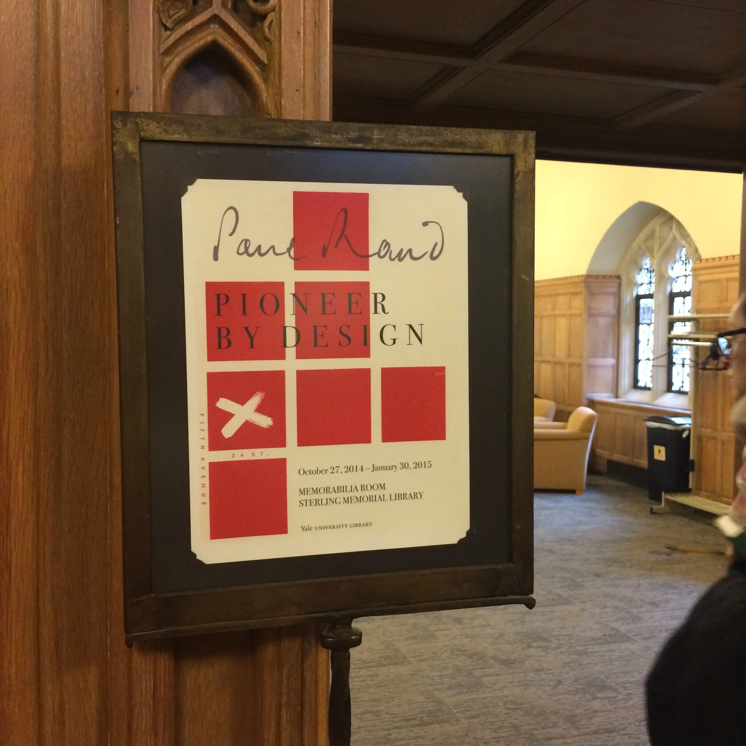
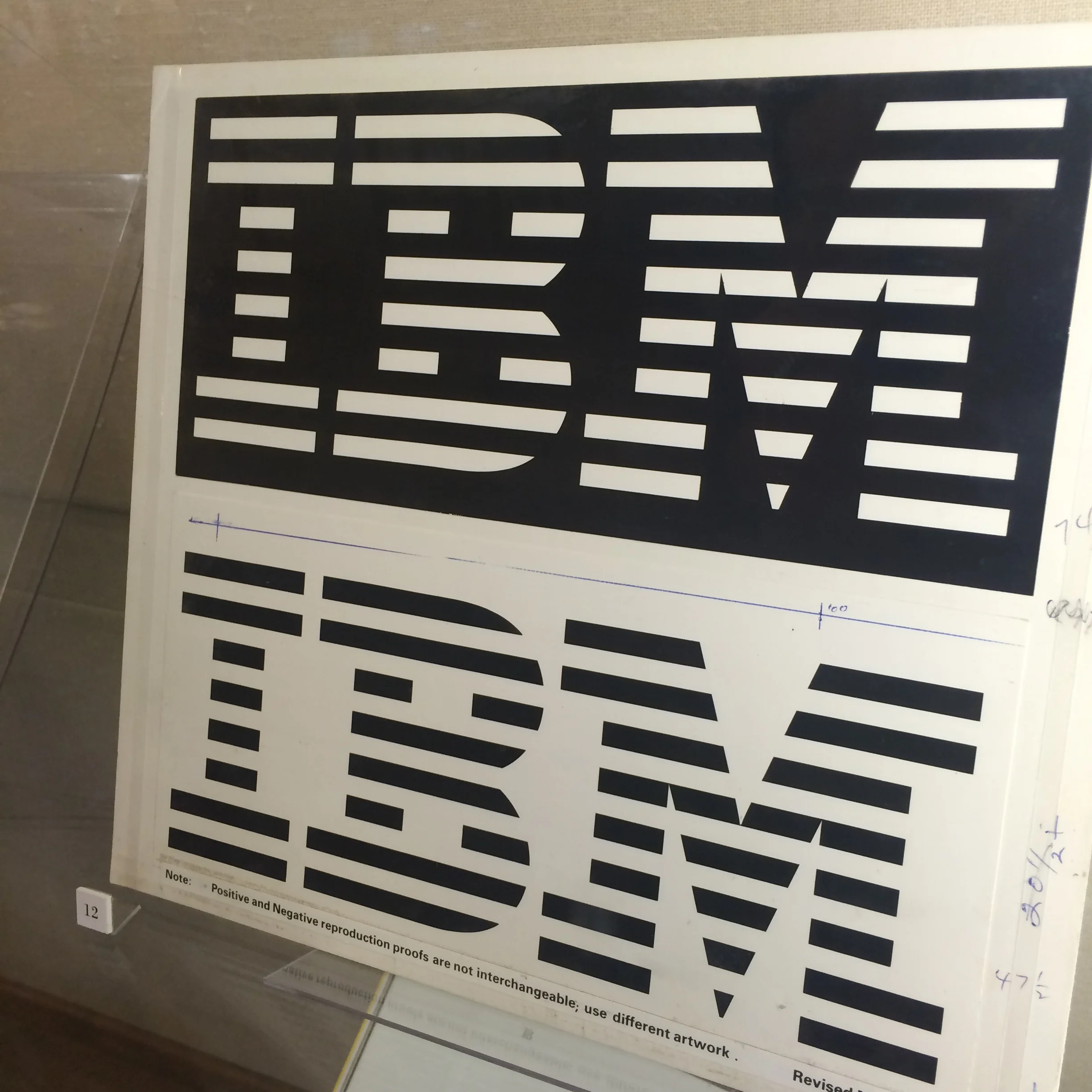
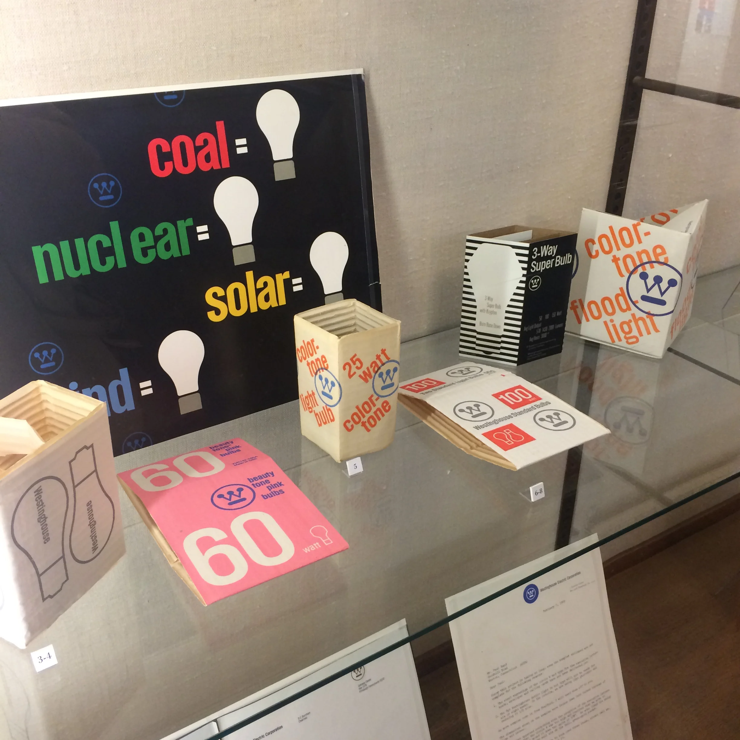
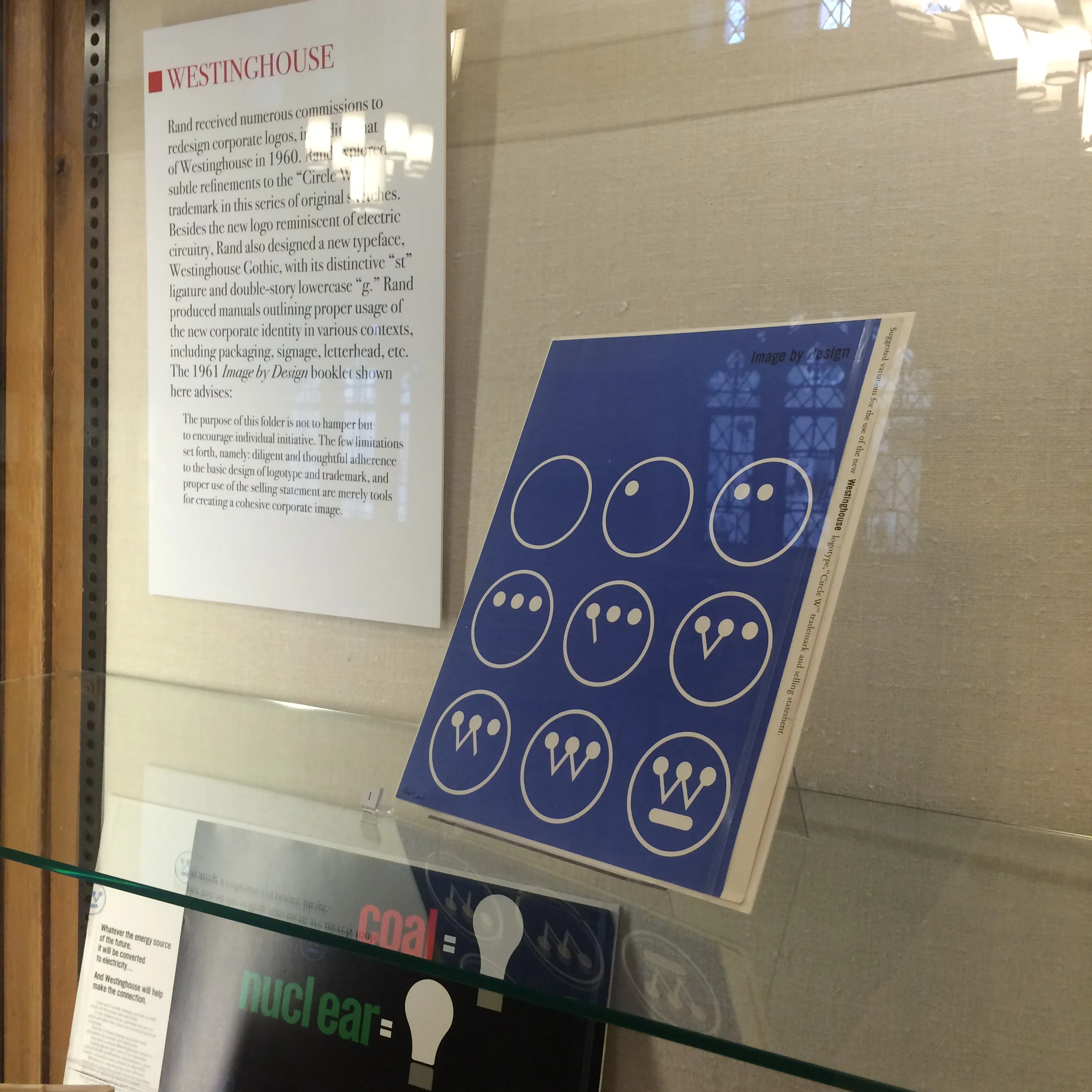
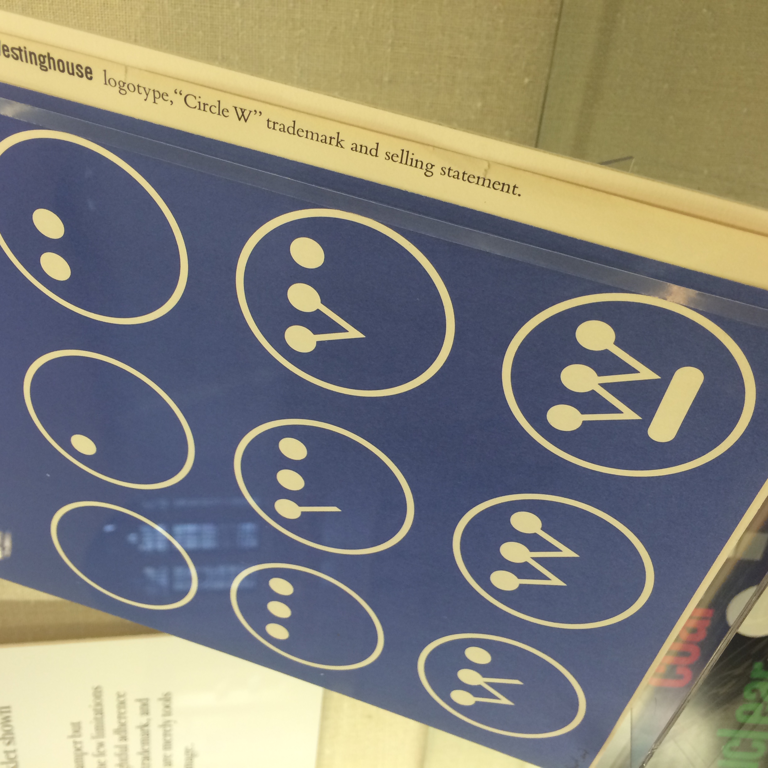
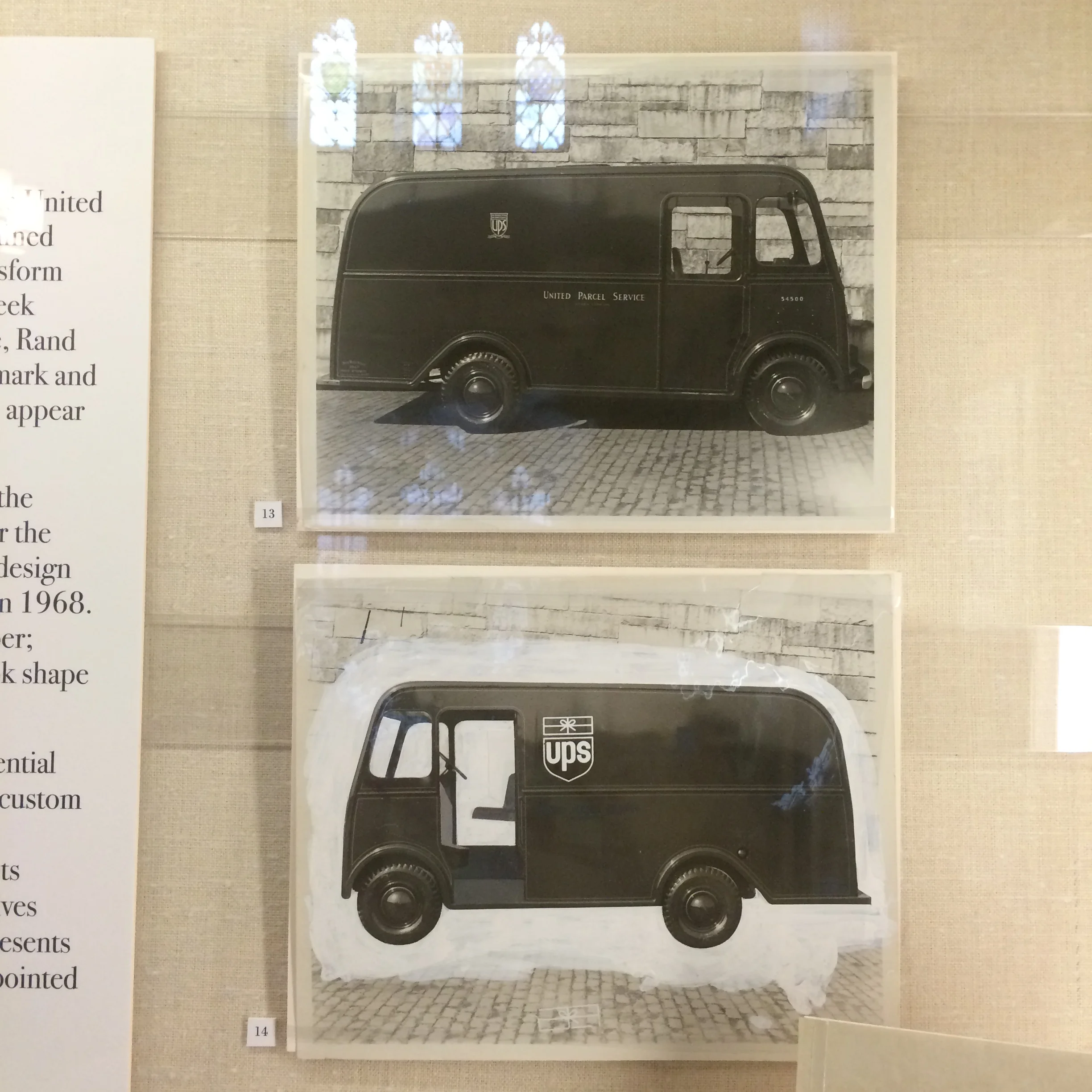
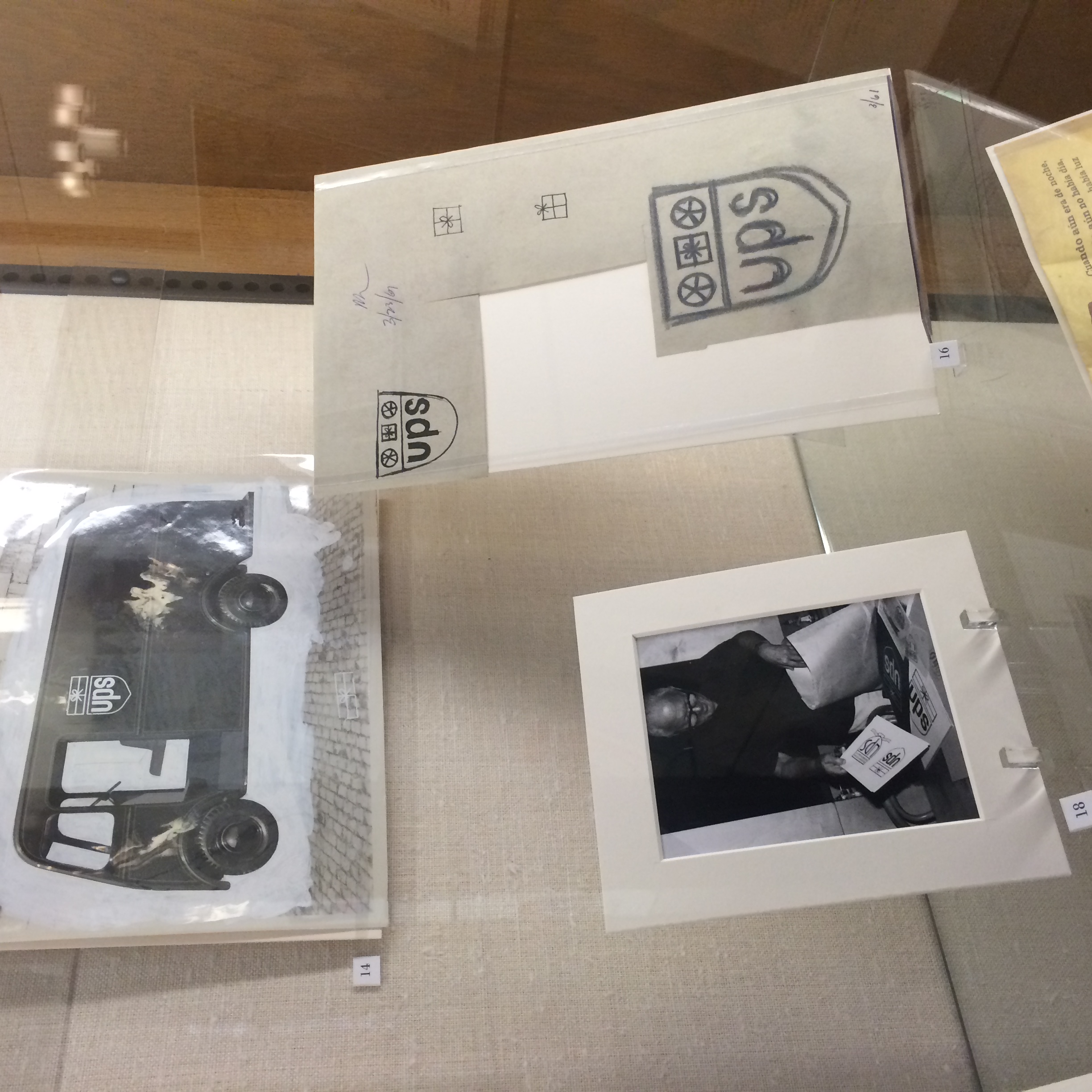
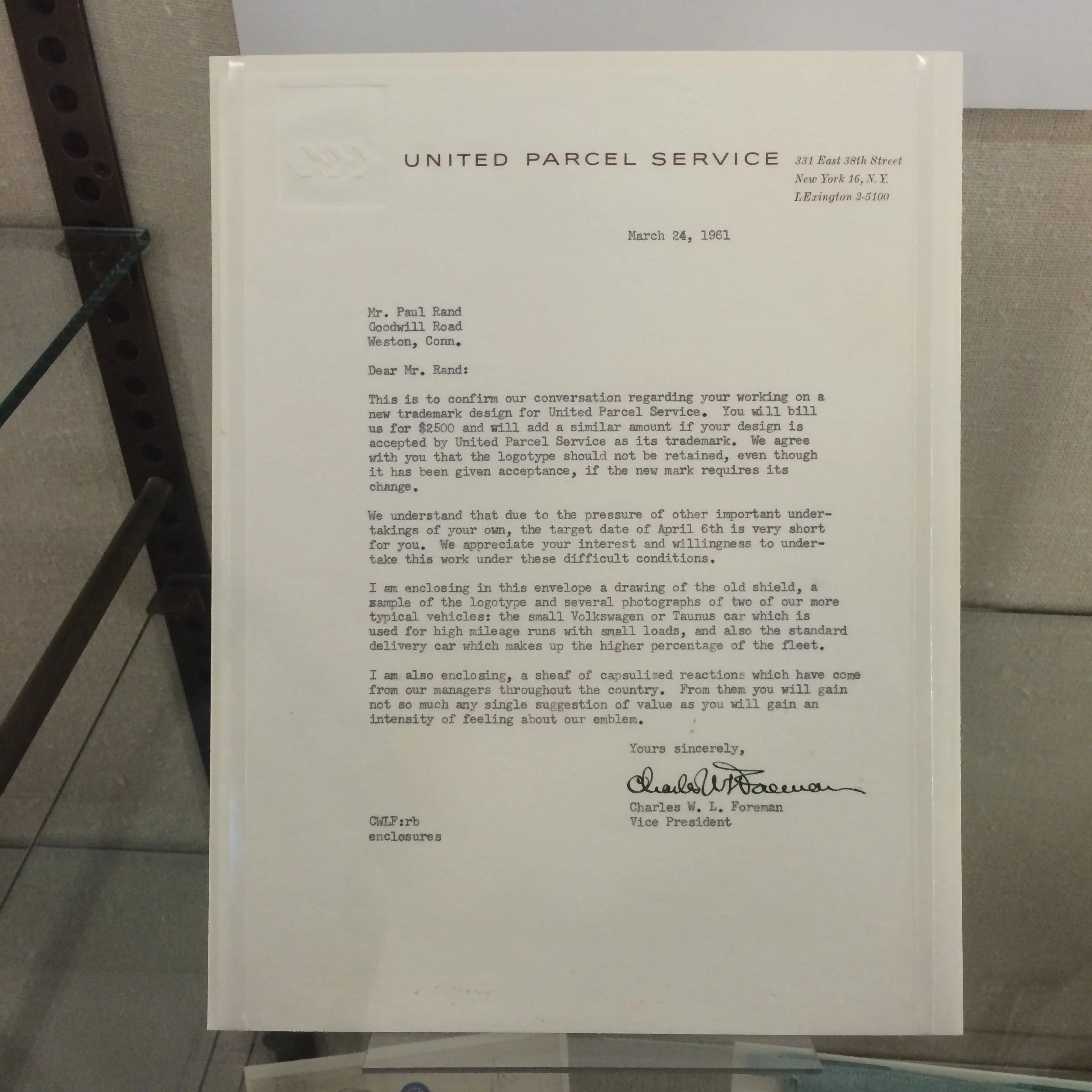
2014 marks the centennial of the birth of legendary graphic designer Paul Rand (August 15, 1914 – November 26, 1996). Rand was one of the foremost American graphic designers of the 20th century and helped establish the so-called Swiss Style of design in the United States. Paul Rand transformed conventions of visual communication for American businesses and consumer culture, and his corpus spans editorial and book design, advertising, packaging, and corporate identity, including iconic logos for IBM, UPS, Westinghouse, and many others. He trained in the 1930s at Pratt Institute, Parsons School of Design, and the Art Students League, he went on to become an educator himself at Cooper Union, Pratt, and later at Yale University, where he taught graphic design in the graduate program from 1956 to 1969. He returned to Yale in 1974.
The exhibit is on display until from Monday, October 27, 2014 – Friday, January 30, 2015 in Sterling Memorial Library at Yale University.
Last evening I attended a lecture given by Leon Botstein, President of Bard College, at the Yale Center for British Art. The lecture explored the discussion about the future and character of the liberal arts studies, including the digital humanities, the centrality of computing, and STEM fields in the University. The intent was to get beyond the rhetoric of defense and outline a genuine reform of undergraduate and graduate education that is persuasive and responsive to the current climate of public criticism, disinterest, and skepticism regarding the humanities and the arts.
Botstein discussed the current structure of the university in our country, and how unfortunate it is that higher-level education is too often siloed into specialized departments or 'majors'. He notes that these departments "inevitably favor their best students, defined as those who hold the most promise for a scholarly career ... the truth is that life is not divisible into majors. Neither is work nor, believe it or not, learning or scholarship." He stressed the importance of being able to explore multiple disciplines relating to, or sometimes not commonly thought of as relating to a specialization or a 'major.' For example, "Studying philosophy might be just the thing an undergraduate engineering major needs to become an innovative engineer. The essential training engineers get in problem solving, using mathematics and the procedures of basic science—not applied science—turns out to be critical in the workplace later on. So, too, is an education in complementary disciplines, including history and philosophy. Likewise, a solid understanding of psychology and literature, not to mention American economic and social history, will serve an undergraduate business major better than a course in marketing, especially if that student has the acuity and instinct to recognize its value."
Many of these thoughts are outlined in an passage entitled The Love of Learning that Botstien adapted from his 1997 book Jefferson's Children: Education and the Promise of American Culture.
Reading: The Opposite of Loneliness
“We don’t have a word for the opposite of loneliness, but if we did, I could say that’s what I want in life.” — Marina Keegan
All the stories—fiction and otherwise—were real and relatable. She was able to take on many different personas with such detail, acuity and insight — impressive for someone of her age. Great read, hard to put down.
related links:
Marina Keegan on Wikipedia
Yale Daily News Cross Campus
Facebook for The Opposite of Loneliness
Instant New York Times bestseller, Marina Keegan’s posthumous collection of award-winning essays and stories. The story behind the stories: Author, playwright, and journalist Marina Keegan’s star was on the rise when she graduated magna cum laude from Yale in May 2012. She had a play that was to be produced at the New York Fringe Festival and a job waiting for her at The New Yorker. Tragically, five days after graduation, Marina died in a car crash. Even though she was just twenty-two when she died, Marina left behind a rich, expansive trove of prose that, like her title essay, captures the hope, uncertainty, and possibility of her generation.
Today Ireland's Great Hunger Museum's "Famine Folios," a project I've been working on for the past 14 months, went to press.
"Famine Folios," commissioned by Ireland's Great Hunger Museum at Quinnipiac University, are a part of a new publication program which provides a unique Famine resource for scholars and researchers.
The "Famine Folios" series launches with four 30 —60 page illustrated essays, each written by well-known professors and historians of the Famine in Ireland. These illustrated pamphlets reference pieces of art within the Museum's collection and are also a demonstration of Ireland's Great Hunger Museum's extensive database of pictorial newspapers (The Illustrated London News, Pictorial Times, etc.) The program intends to continue to release four pamphlets each year.
The authors featured in the initial launch include:
Luke Gibbons, professor of Irish literary and cultural studies at the National University of Ireland, Maynooth.
Christine Kininealy, professor of history at Quinnipiac University and foundation director or Ireland's Great Hunger Museum.
Catherine Marshall, art historian and former curator at the Irish Museum of Modern Art, Dublin.
Niamh O'Sullivan, professor emeritus of visual culture at the National College of Art and Design, Dublin and curator of Ireland's Great Hunger Museum.
All Illustrated pamphlets will be available for purchase at Ireland's Great Hunger Museum, at Quinnipiac University.


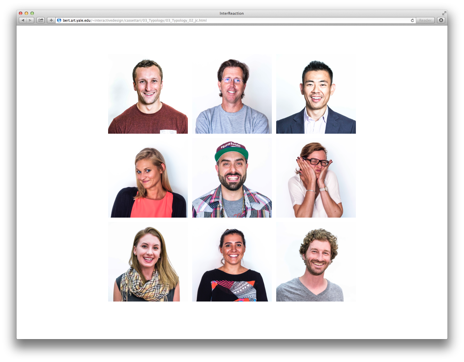
This summer I took an Interactive Design course at Yale. During the five-week program we explored design interests through tutorials, readings, group discussions, and critiques. Our main focus was developing and discussing our individual design approaches and methods while honing a critical eye for evaluating a web experience. We learned basic coding skills in HTML and CSS, and were introduced to PHP and JavaScript. We covered a wide range of web-related design issues during our class discussions—from from technical questions, to design principles and strategies, to ethical concerns. Within this context, we worked to develop website designs that create rich experiences for users that respond in compelling ways to changing inputs, conditions, configurations, and actions. Our aim throughout was to make thoughtful, intentional design decisions that support our individual points of view while remaining engaging to users over time. (Introduction to Interactive Design, Julia Novitch, MFA)


Serendipitous Poetry from The New York Times
http://haiku.nytimes.com


Today we toured the open spaces of Rudolph Hall, the home of the Yale School of Architecture. The tour featured highlights of the nine-story structure, uniquely designed by the former Dean, Paul Rudolph.


Took a stroll by the beautify lit Irish Hunger Memorial in Battery Park last night.
A brief History about the memorial: The Irish Hunger Memorial, designed collaboratively by artist Brian Tolle, landscape architect Gail Wittwer-Laird, is devoted to raising public awareness of the events that led to the Great Irish Famine and Migration of 1845—1852. It's located on a one-half acre site in the Battery Park City neighborhood of Manhattan in New York City. It serves as a reminder to millions of New Yorkers and Americans who proudly trace their heritage to Ireland, of those who were forced to emigrate during one of the most heartbreaking tragedies in the history of the world.


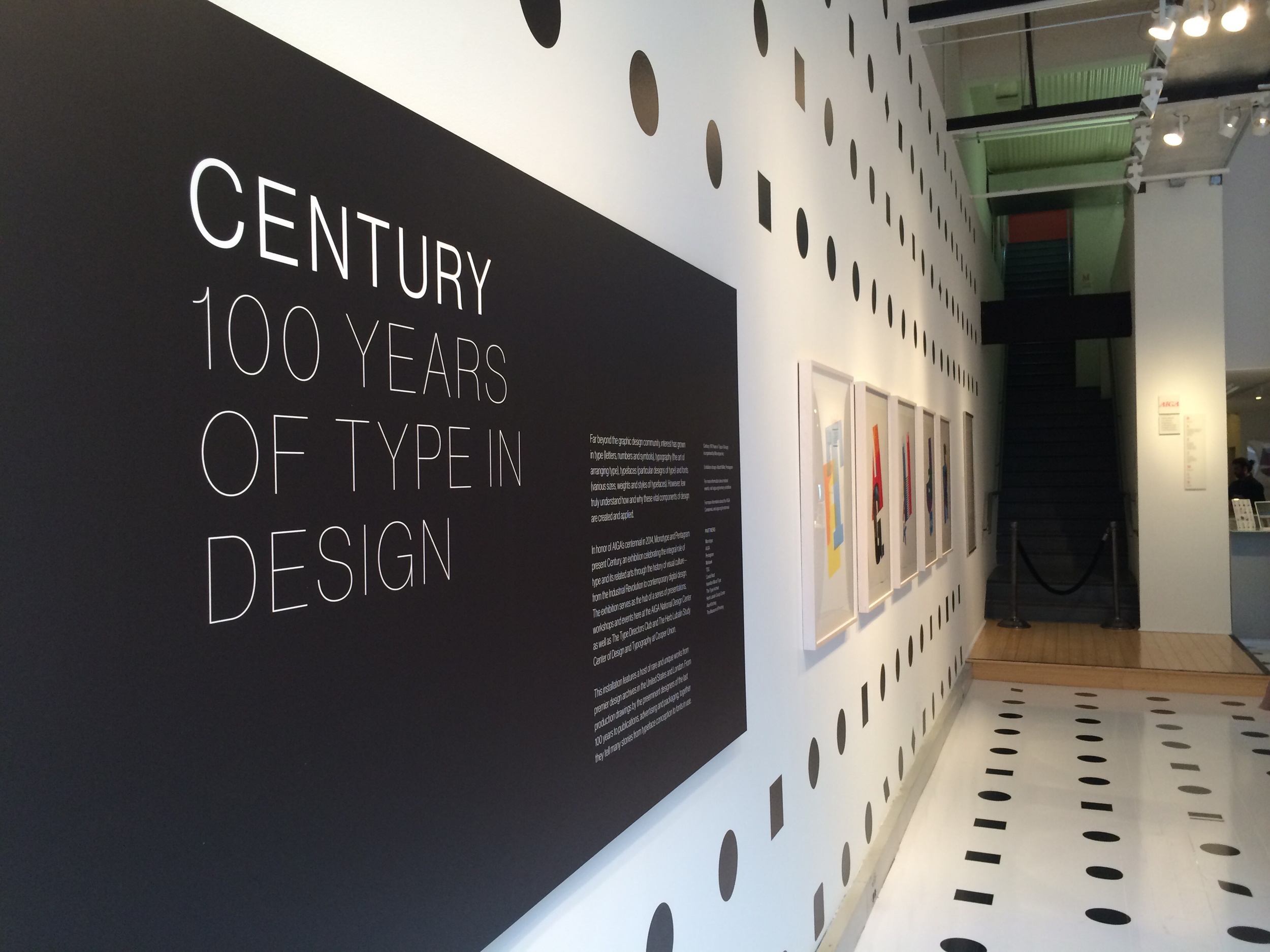
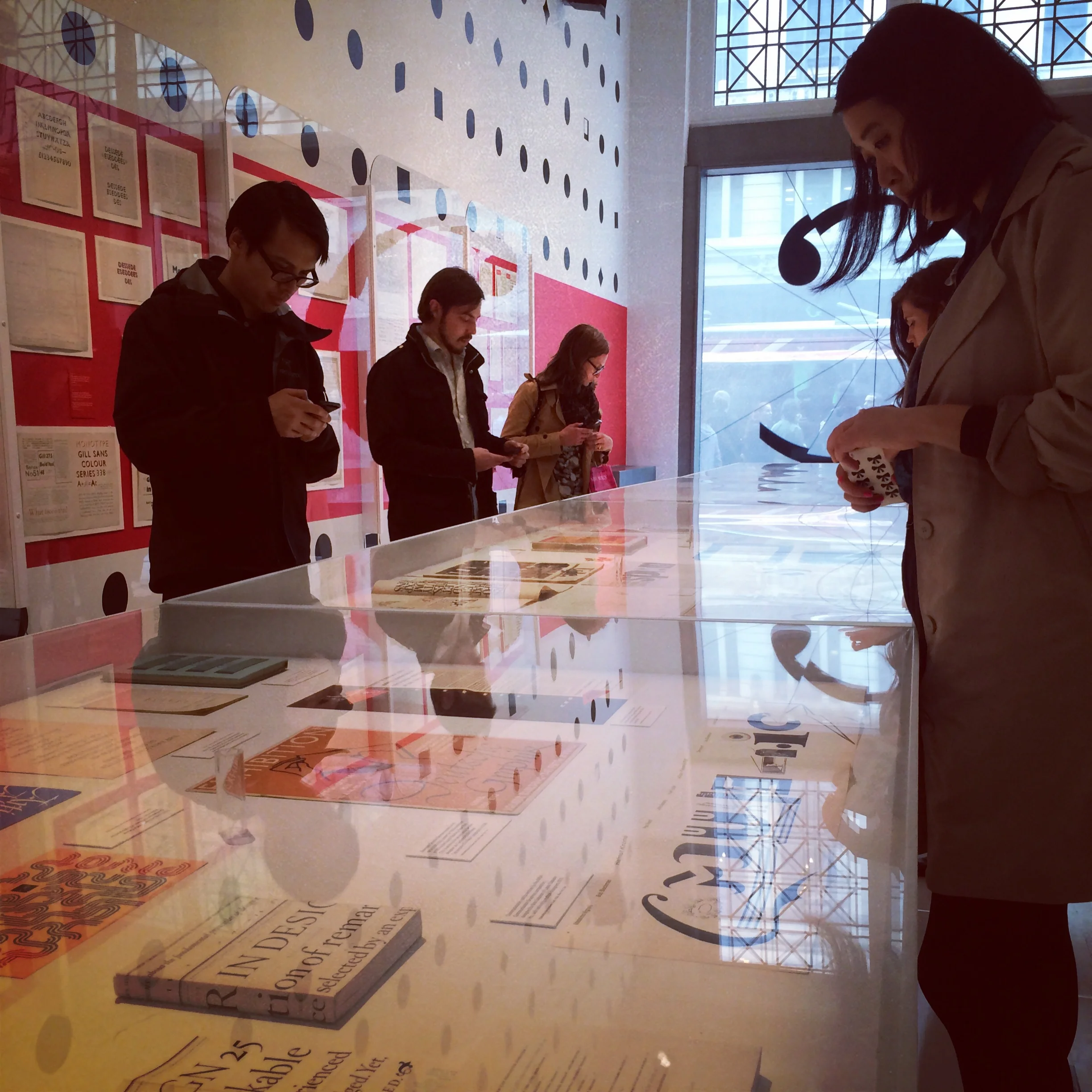
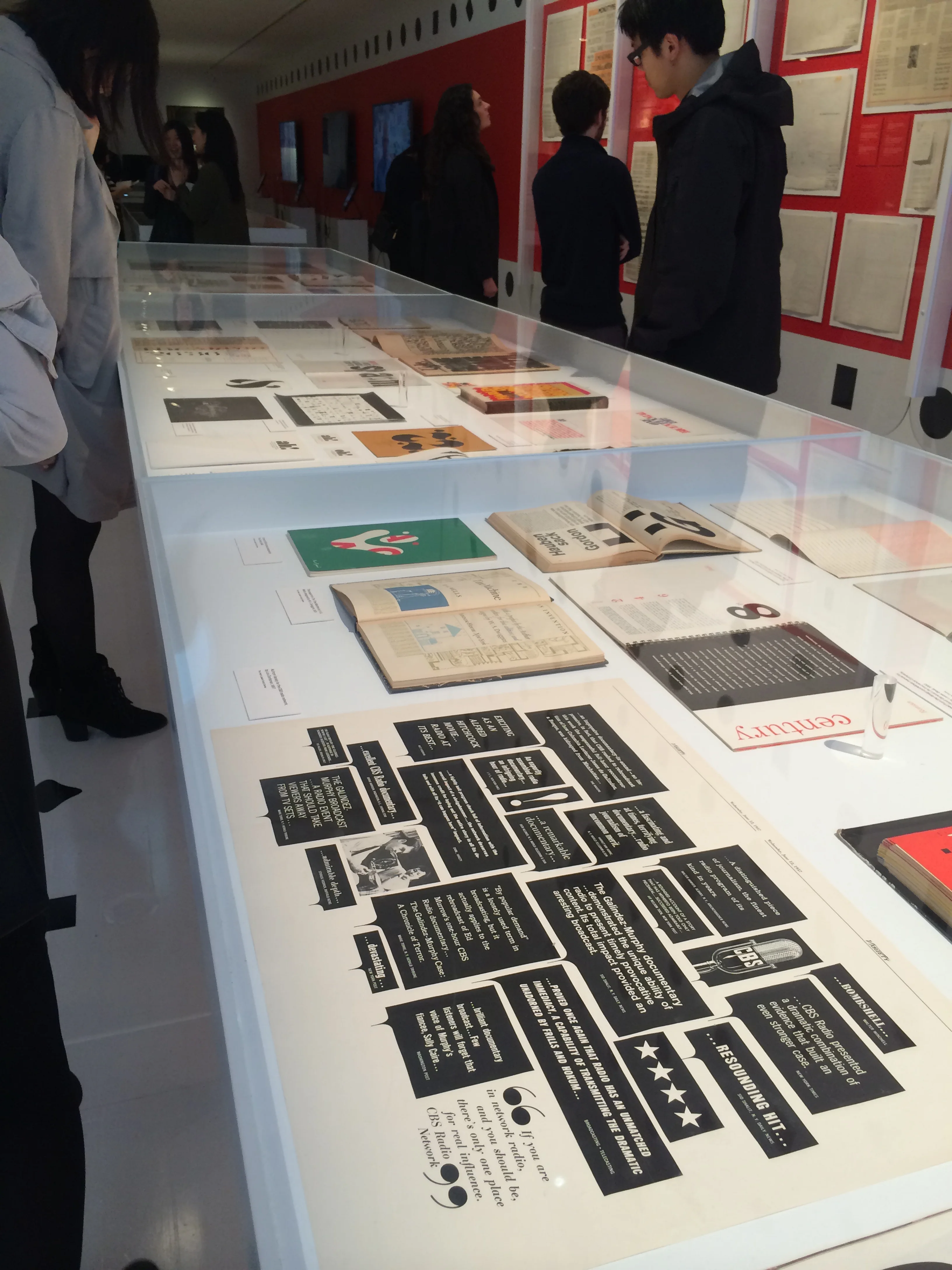
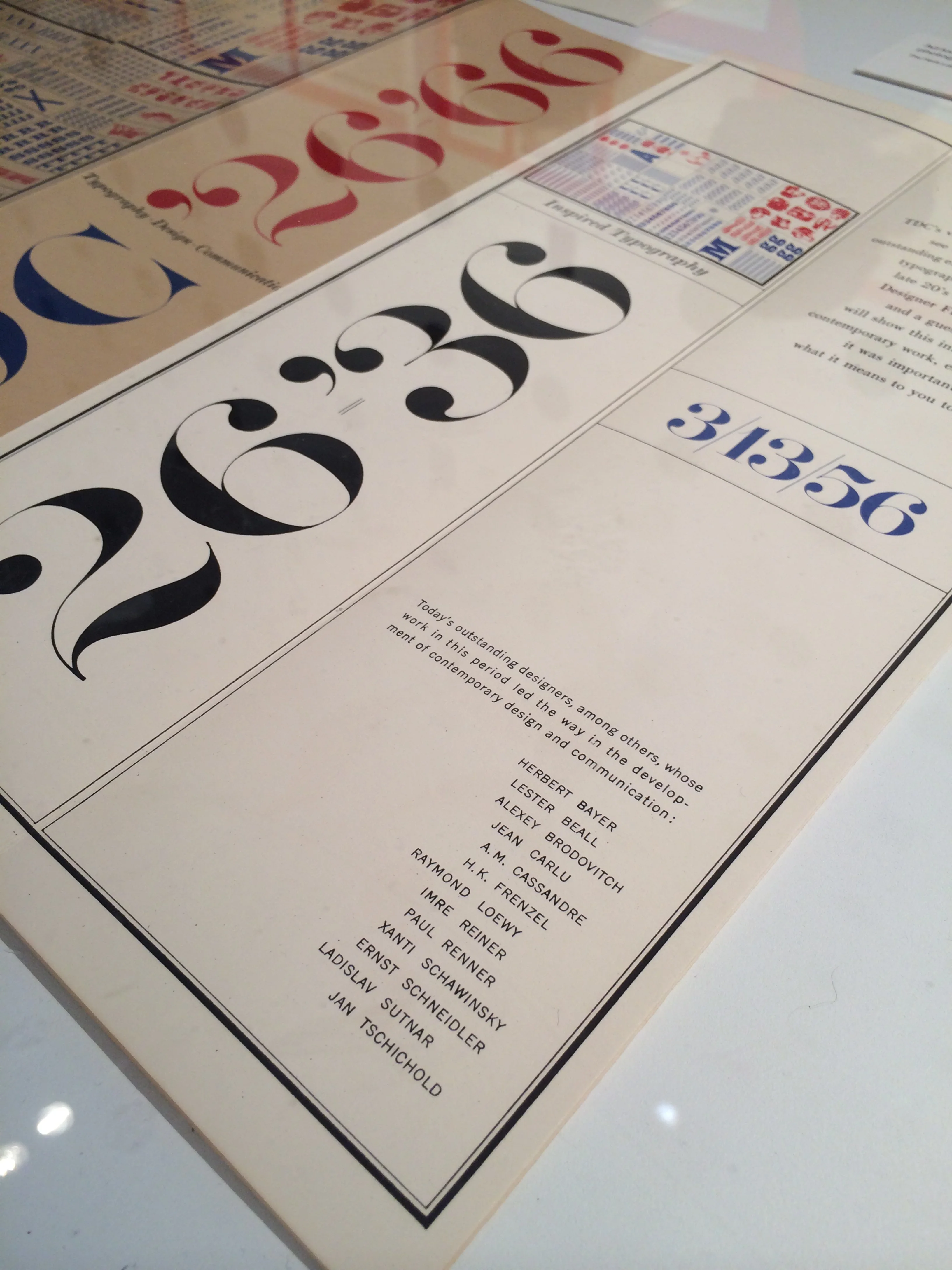
Interest in type, typefaces, typography and fonts has grown far beyond the graphic design community, yet few truly understand how and why these vital components of design are created and applied. This exhibition, organized by Monotype and designed by AIGA Medalist and Pentagram partner Abbott Miller for the AIGA National Design Center, celebrates 100 years of type as a constant influence in the world around us.
Gathering rare and unique works from premier archives in the United States and London, “Century” will serve as the hub of a series of presentations, workshops and events held at the AIGA gallery as well as the Type Directors Club and the Herb Lubalin Study Center of Design and Typography at Cooper Union in New York City. The “Century” exhibition features a range of artifacts representing the evolution from typeface conception to fonts in use. Typeface production drawings by the preeminent designers of the last 100 years, proofs, type posters and announcement broadsides are supplemented by publications, advertising, ephemera and packaging.


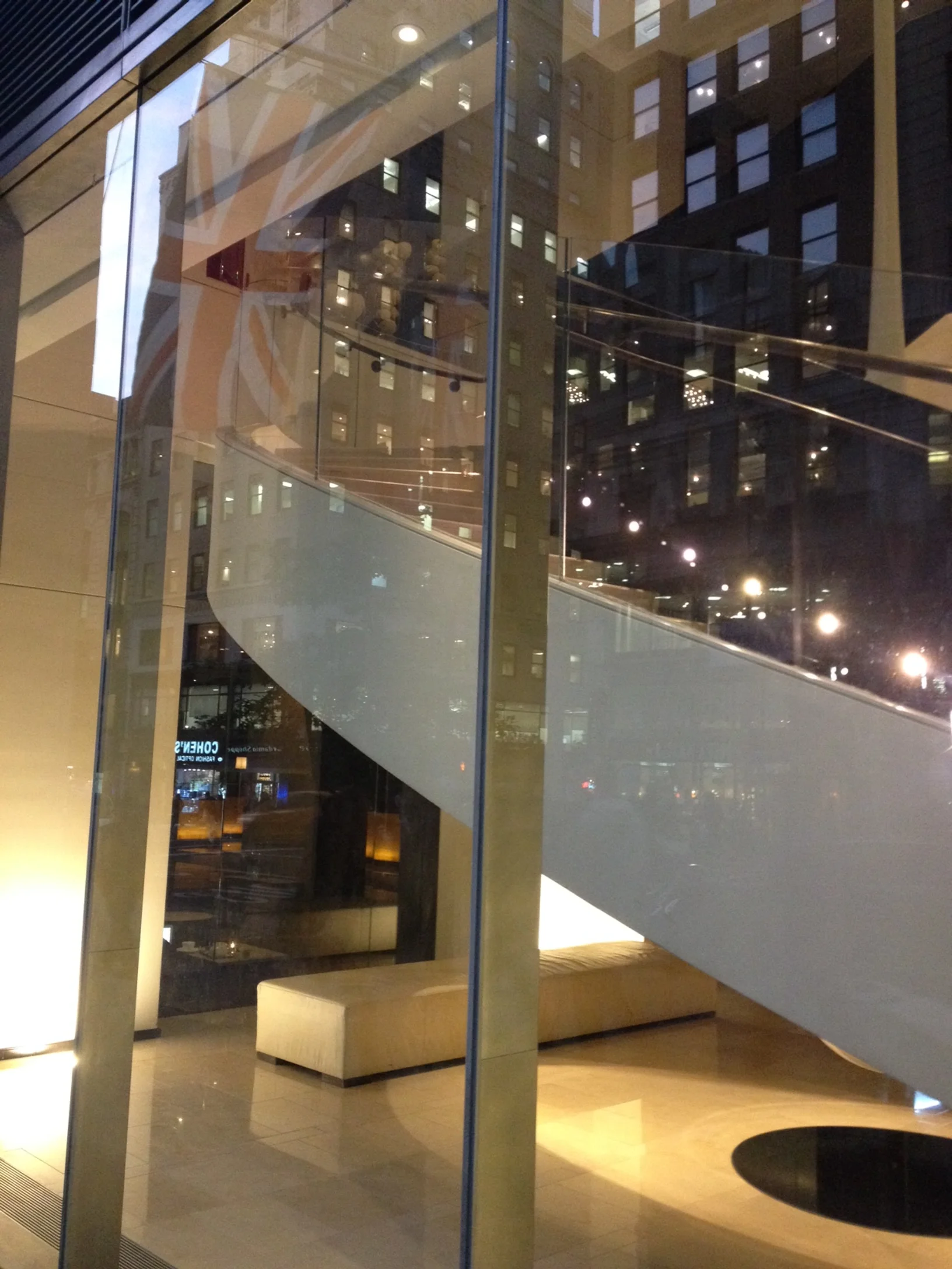
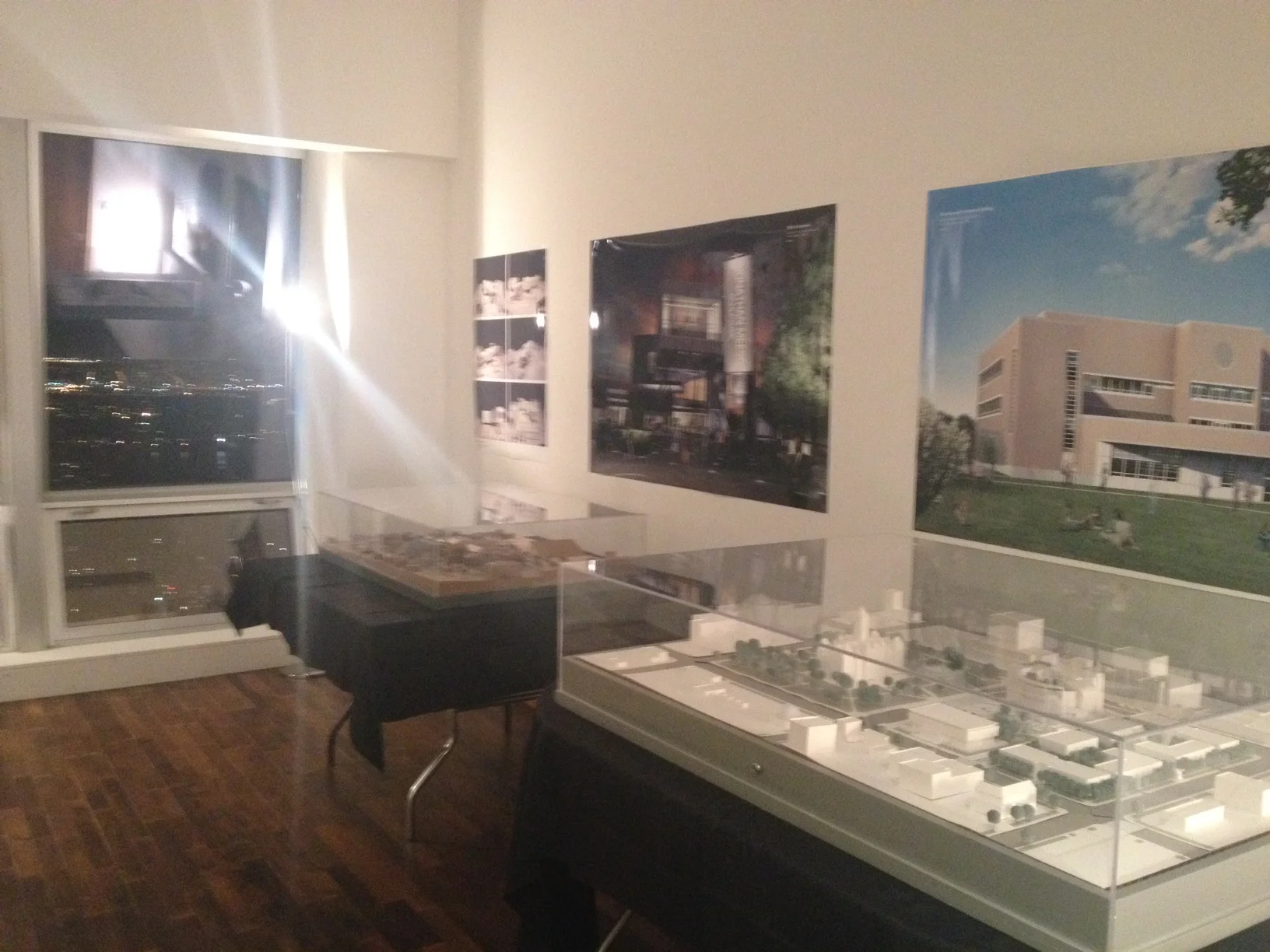
Last evening I attended the publication release and book signing for an architecture book I designed entitled Gwathmey Siegel 3. The event was held in NYC at 400 Fifth Avenue, a building featured in the book, on the 60th Floor in the Penthouse Suite. This is the third book, covering the last decade, in a series presenting over 30 years of work by Gwathmey Siegel & Associate Architects.